Statistical Process Control (SPC) Charts help you see beyond the noise. They plot your data over time, highlight normal variation with control limits, and use simple signal rules to flag when something truly unusual happens — so you can focus on what matters.
Like life, every process has natural ups and downs. You know what it's like, some days are quicker, some are slower. SPC use statistics to help distinguish what we may consider normal ups and downs from what is unexpected or different. This stops us reacting to the noise in the data but instead responding to the actual signals.
How SPC Charts Work
SPC charts plot a measure over time (e.g., reporting times, turnaround times, volume) and overlay:
The Central Line – mean
Upper and Lower Control Limits – the typical range of natural variation
Signal rules – a set of patterns or conditions whose probability of occurring naturally is close to zero, indicating something outside normal behaviour
When the data stays within the signal rules, the process is considered in control or normal. When it doesn’t, that’s a signal something may have changed.
Using Arkturus, it's easy to turn a line chart into an SPC chart:
Select line chart from the chart options
In chart options select Control limits (Manual or Auto)
Select a colour to represent positive or negative change
Save the change and you are ready to spot signals!
Understanding Signal Rules (Made Simple)
SPC charts use a few simple “signal rules” to help you spot when something genuinely unusual is happening. No math's needed — just a feel for what the patterns mean.
One or two points outside the control limits Something out of the ordinary happened during that period. It’s a good idea to take a quick look at what caused it, but we don't need to rush to fix it.
A short run of points gets close to one side of control limit This tells us the process might be shifting. Nothing confirmed yet — so it's really important to find the cause before responding.
A long run of points on the same side of the central line This is a stronger signal. It means the process has genuinely changed and settled into a new level. At this point, the mean and control limits are reset to reflect the new normal.
Athena’s Top Tips for Getting Value from SPC:
✓ Don’t chase every data point ✓ Teach your staff to read the signals ✓ Use it to learn, not blame ✓ Choose meaningful measures
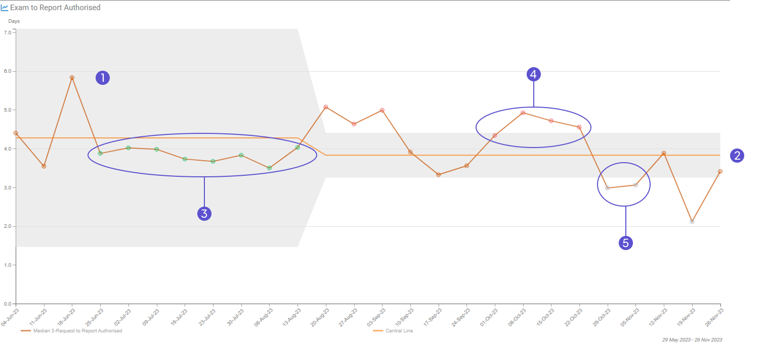
The shaded band between the control limits represents the normal range of variation. As long as points stay inside this band, the process is considered stable.
In the centre of the chart, you can see several points sitting close to the average (the central line). This is what stable day-to-day variation looks like.
When several consecutive points fall on the same side of the mean (more than 7), SPC considers this a signal of a real shift in the process, not random noise
A small cluster of points sits noticeably above the mean for a short period. This doesn’t necessarily signal a change — it can simply reflect a brief change in workload or workflow — but it’s something to keep an eye on if it continues.
Two points sit clearly below the lower control limit. This is a special-cause signal, meaning something unusual happened on that date. It’s worth checking what occurred (e.g., staffing, system behaviour, case mix).
“Quality comes not from inspection but from the improvement of the process"